
As a little Australian publication, the opportunity to get in for review the Rado HyperChrome Captain Cook was something we just couldn’t pass up. Here goes!
History
A little history lesson for the uninitiated/overseas readers, Captain James Cook was a British explorer/navigator and is said to be the first recorded European contact with the eastern coastline of Australia. Rado first released a Captain Cook back in the 60s and the model we have in today is the modern update which is as close to as a like-for-like reissue as you’ll get.
Dial
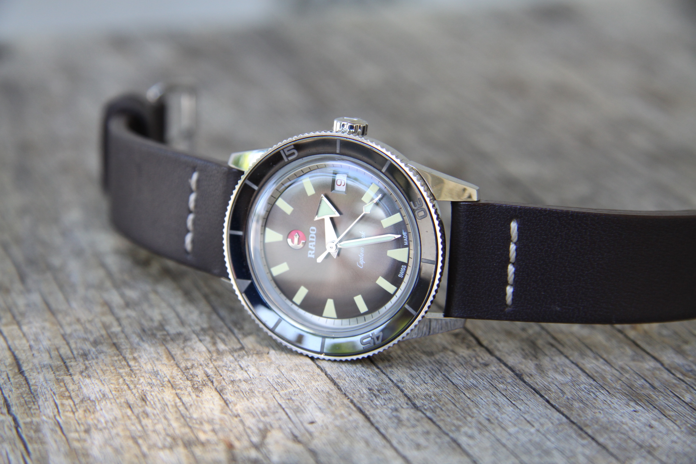
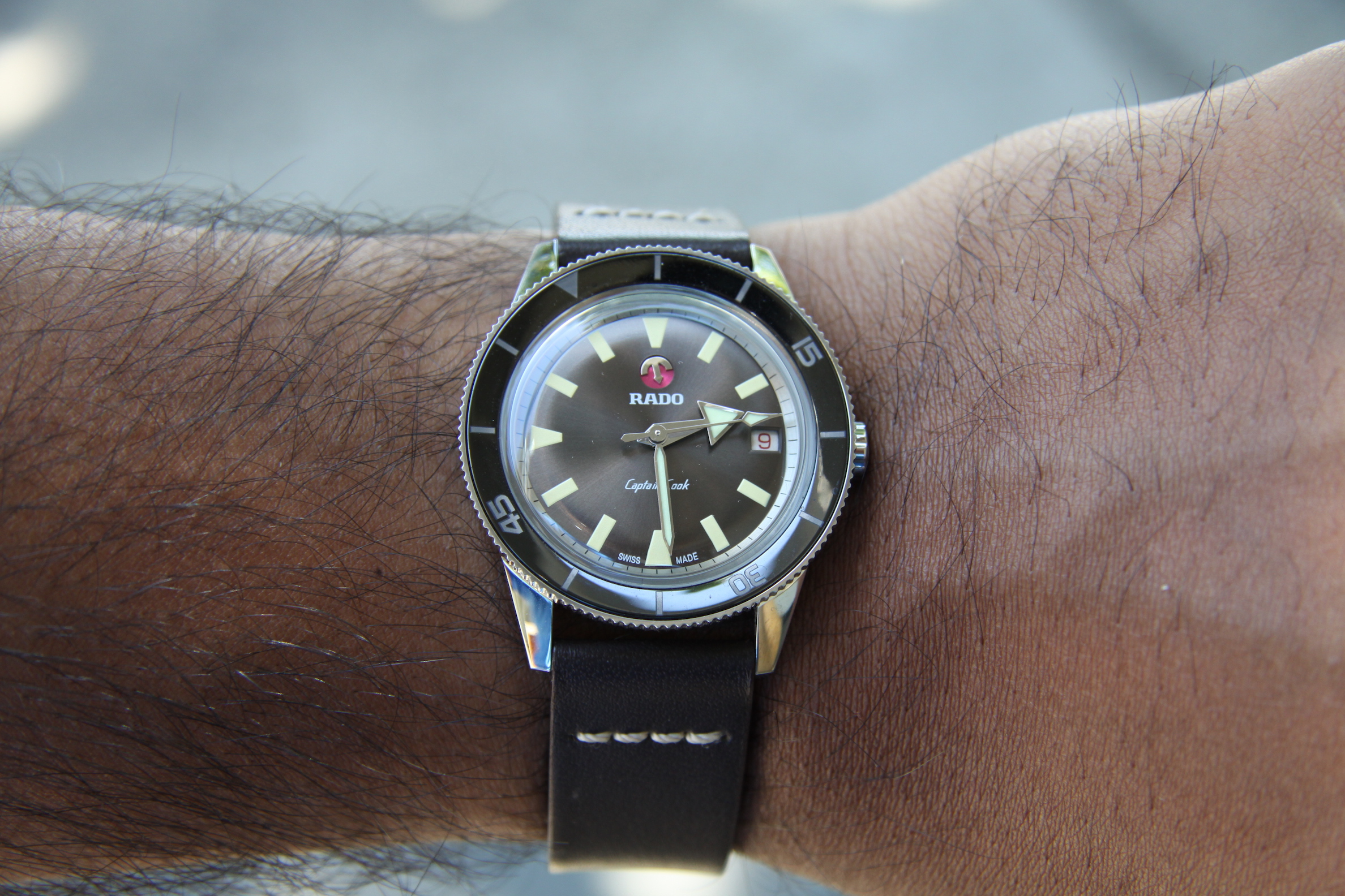
The dial comes in what I’m describing as an olive brown, but has also been listed as a number of grey variants. It’s no mean feat to put a single colour to it, since the light sunbursting means that the light-play is dynamic. The doming of the dial has the effect of making the outer rim of the dial darker than the inside, which I love. It certainly gives a vintage vibe but isn’t something pastiche or ostentatious.
Faux-patina-esque painted markers represent hours, with trapezoids/thick triangles denoting the 12, 3, 6 and 9, and rectangular blocks for the remainder. Herein likes a condundrum for me. I have a great deal of appreciation shown for the respect to the original Captain Cook, which also had painted markers, but use of a sandwich application/applied markers could provide more depth and detail that would’ve been a great addition. Although, I might be asking too much at this price point.
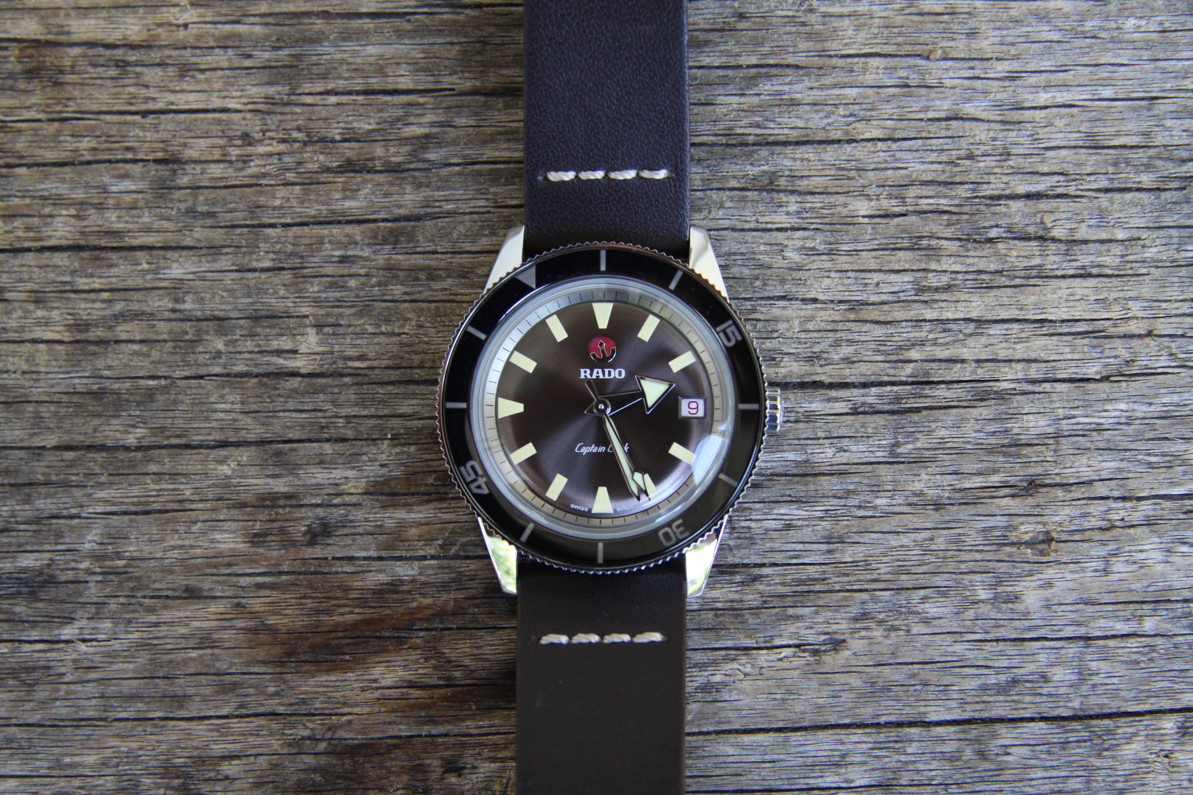
The hands are a broad arrow variant, the broad arrow dominating the hour, a sword for the minute and a pike head for the second. Lume is applied liberally in the faux-patina tone for all and seems to glow more brightly for the hands than the markers.
Just like the doming provides levels and textures to the main part of the dial, the chapter ring is incorporated into the slanted rehaut. The refraction and interplay with the domed crystal viewed from above continues the various angles and textures present below the crystal.
The date is ever present in a simple, but well implemented date window at 3. True to the original is red font for the date, which is a nice touch.
Branding is a simple affair, with just the Rado logo and font above the centre of the dial and “Captain Cook” and “SWISS MADE” below the dial. The red of the Rado logo matches nicely with the date colour and the swinging anchor contained in the logo is not something often noticed, but a fun addition.
Case
The steel case runs in at a demure 37mm (diameter) x 43mm (lug to lug) x 11mm (tall) dimension set. The Captain Cook range also comes in other variants, including a 45mm option, but we’ll stick to what we have here today.
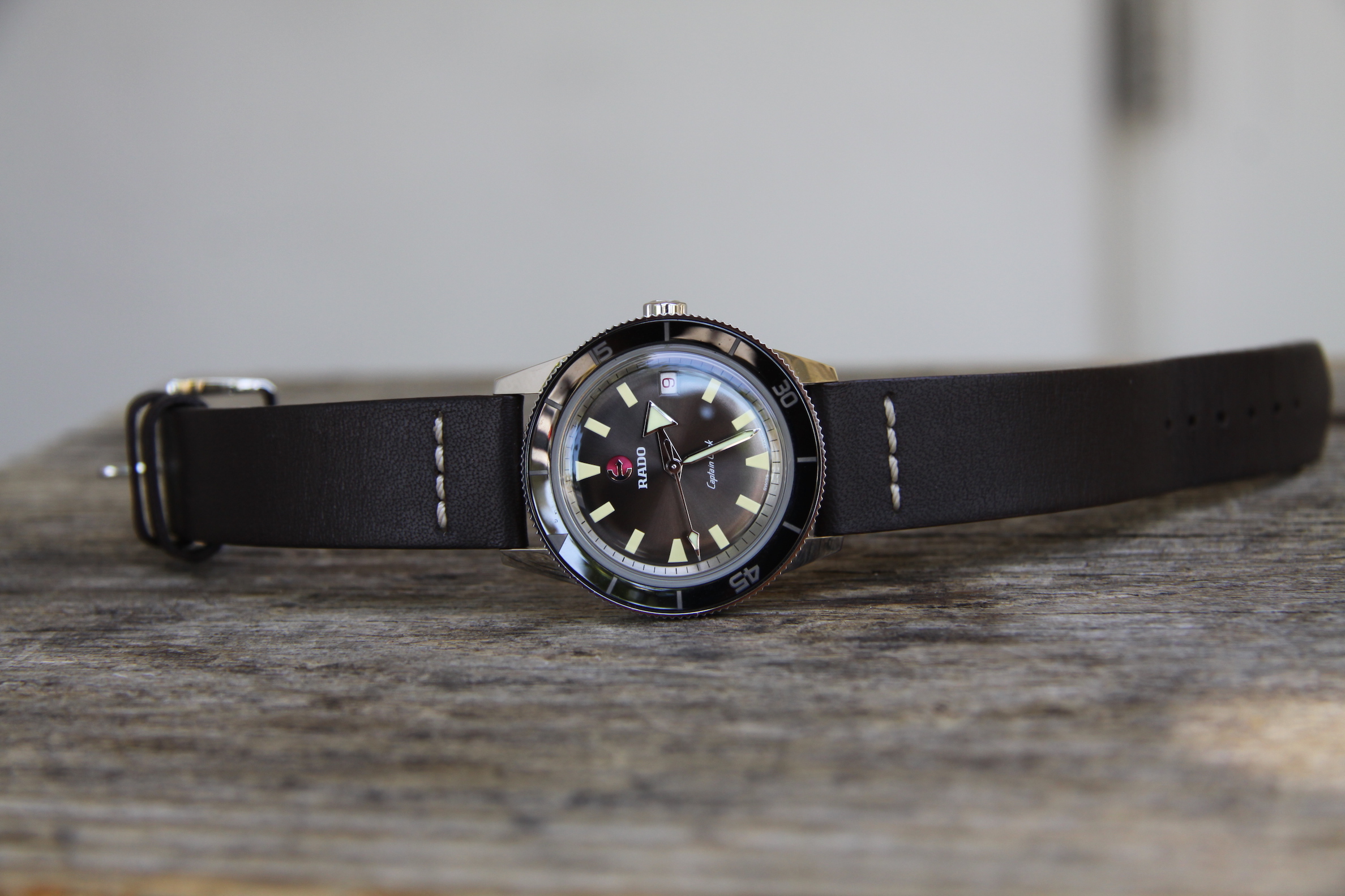
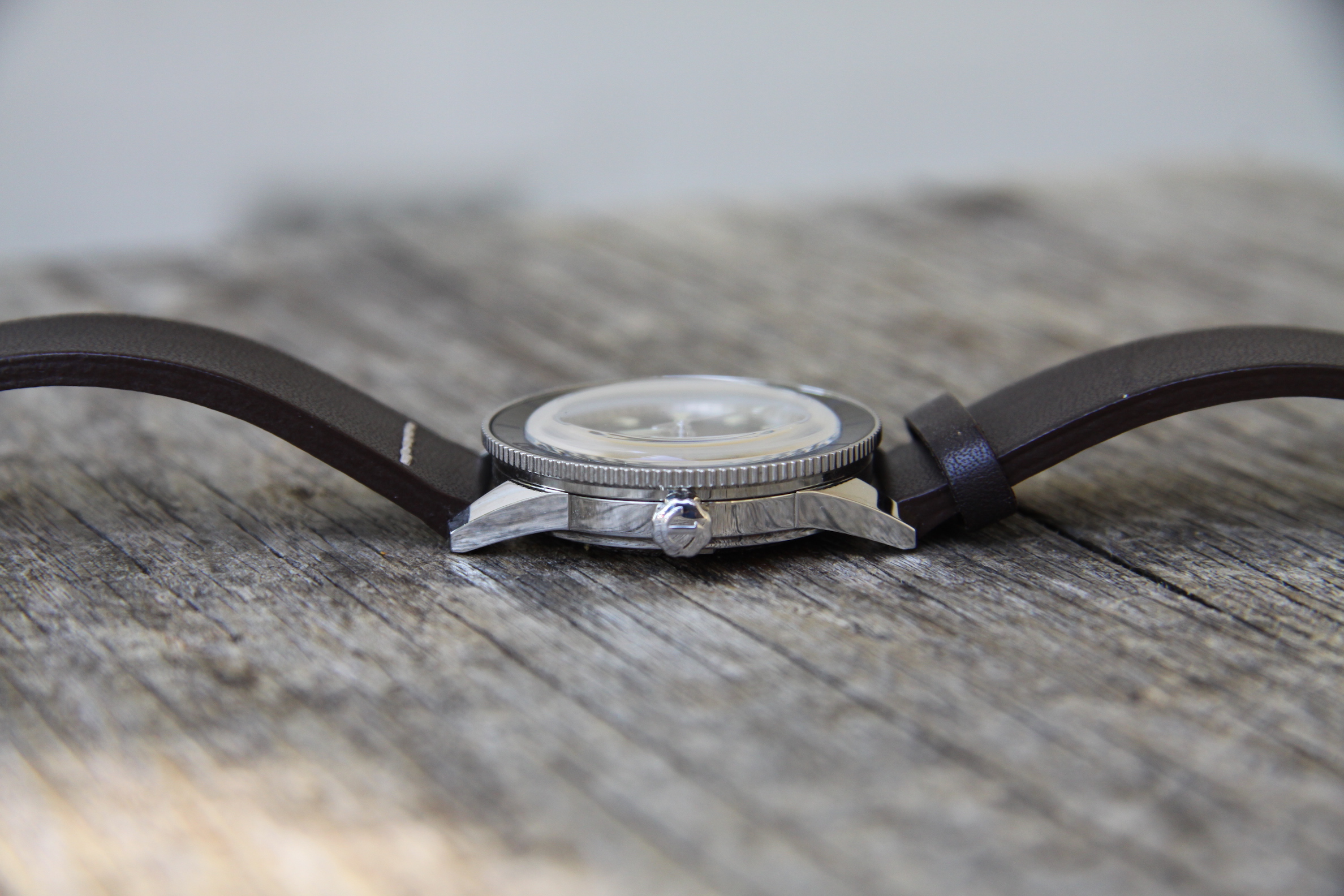
The case is fully polished and broken up into three parts – bezel, midcase and caseback. The lines are sharp and the case gave out the perception of being study and well constructed.
A 120 click coin-edge provides the grip for the glossy black ceramic bezel which was both comfortable and easy to grip. There was a little backplay and wiggle on the bezel, but nothing to be overly worried about. There’s about a 1mm bezel overhang over the midcase, which certainly aides in grip, but does mean that access to the crown (push-pull variety) is actually quite difficult (maybe I’m just clumsy). This might not be a problem for most (it is an automatic watch after all), but it does detract from the odd-manual wind session.
The bezel is broken up by numerals for 15, 30 and 45 and a triangle at 60. I was, however, a little surprised not to see a lume pip at the centre of the triangle. The structure of the bezel is quite fascinating, dipping in towards the centre of the dial like a big dish. For me it adds additional dimension and visual complexity to the dial, and I have a sneaking suspicion that it helps with light reflection and viewing angles.
The straight lugs are long-ish, but their length is accentuated by their starting further into the midcase on the outer side. They are both flowing by reason of the nice connection with the midcase, but bold in their size, together creating a nice presence on the wrist.

In all, the 37mm case wore well on my wrist, and had no issues with cuffs and the like. It never felt too small or like it was lacking in presence, and had all the usual benefits of smaller watches – comfort, cohesive design etc. Admittedly, this is coming from someone that happily wears 35mm bauhaus inspired watches, but I’d encourage prospective buyers to see how the Captain Cook feels on the wrist before making a judgment on specs alone.
Movement
In a first for us, the Rado was equipped with the ETA C07.611, which is an updated ETA 2824, now boasting 80 hours power reserve, but a 3Hz beat rate.
Those who are quite particular about their movements/price values (I’m paying WHAT for a miyota etc etc) will know that this movement is also available in other lower priced watches, like the Tissot Powermatic. If getting the best calibre for the price is your go, then there are other ETA owned brands and watches which can better serve that purpose. Otherwise, the movement performed admirably, though I am used to a cleaner sweep.
Strap
The strap is a vintage inspired number with a visible through stitch at the lugs. I think a lot of purchasers in this price segment (AUD $2475) look for a steel bracelet to aide in the functionality and ruggedness of the piece and a three piece oyster bracelet variant is available for a $150 premium. However, I found the strap combination preferable bearing in mind that I used it primarily as a desk diver. For more rugged and athletic pursuits, a cheap nato strap could perform any of the bracelet functions admirably.
While the visuals and practicality of the strap really struck a chord with me, it was a bit thick and unwieldy (for my preference) and personally I’d be looking elsewhere for a quick, cheap and easy upgrade.
What struck me most about this watch was that Rado has a really solid understanding of what many modern consumers are after. At virtually every price point trade-offs need to be made, but I can’t see anyone genuinely in the market for the Captain Cook actually being affected by a lower than average water resistance (100m) and the compromises in the movement (power reserve prioritised over beat rate). If buyers can move past the 37mm size, they’ll find themselves with a well built, appropriately spec’ed watch with a lot of character.